
Hey friend,
How to go from getting someone’s attention to making them take action?
That’s the question every landing page builder tries to answer.
When someone lands on our page, we want them to start reading. And whoever keeps reading also needs to take the final step we’ve designed the page for, be it buying a product or leaving their contact details.
This week, I’ve spent “with my nose in books,” as we say in the Netherlands, looking for best practices for landing pages. Unfortunately, there’s not a lot of great material available in books about this topic. But a reader and marketing whiz named Sam shared an excellent article by Julian Shapiro that captures everything a landing page needs.
In the spirit of learning in public, I’m sharing my summary of the article here. I finish the newsletter with a short case study of three landing pages that show the principles I’ve distilled.
Three components every landing page should have
Julian Shapiro’s article on landing pages is part of an in-depth guide about startups, from which we can learn a lot for teaching via email.
But we’re individuals trying to get people to sign up for a single course, so we need fewer pieces to get things working.
Let's get started with the structure Julian recommends for landing pages:
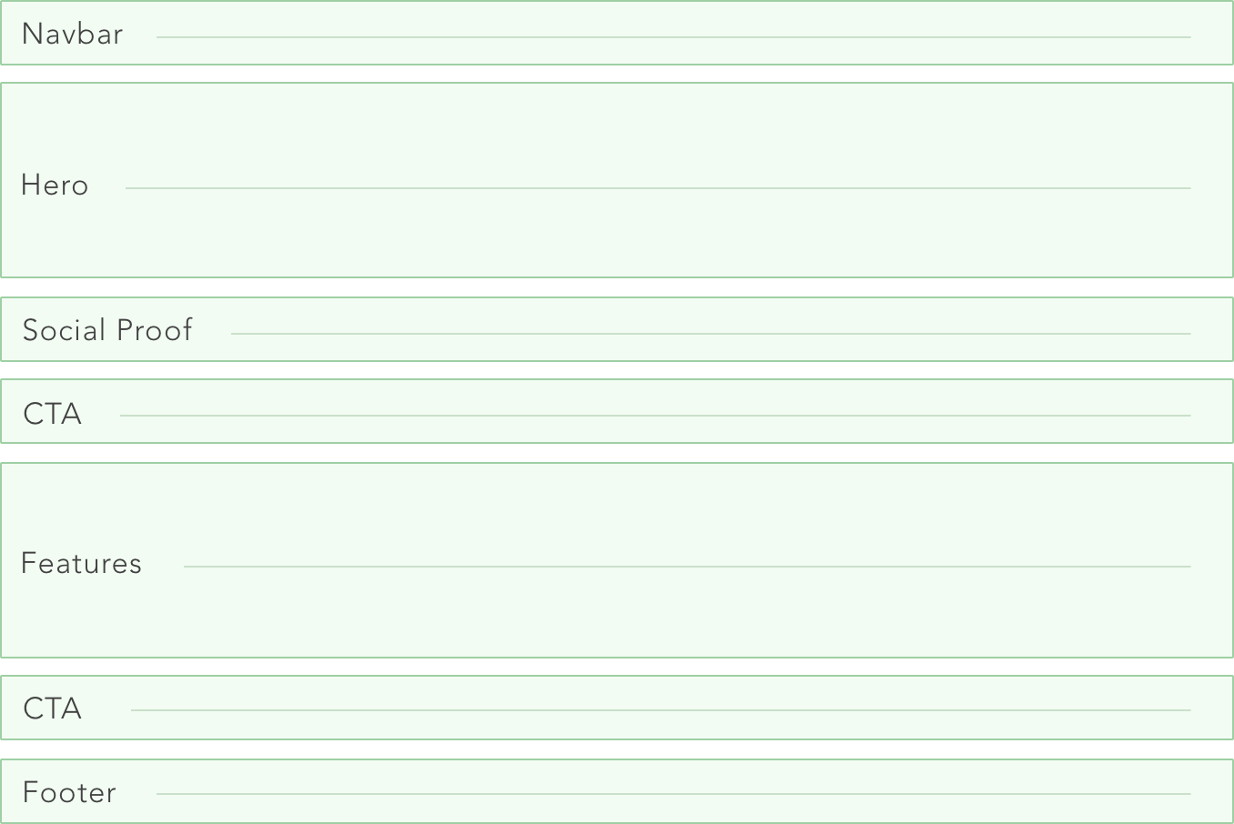
I don’t think we need all those parts to create a landing page for an email course. What we’re building is a so-called “squeeze page” where we give visitors two options:
- Sign up for the email course.
- Close the browser tab.
That means we have no links to other pages, so we can drop the navbar.
And because footers also tend to contain mainly links, we can drop that as well (we can give our address and contact info in the first email we send them).
We can even leave out social proof if our copy is strong enough. Plus, we don’t have any testimonials when first creating our course, so I regard it as optional.
That leaves us with three components:
- A hero section. This is the area “above the fold,” meaning the part that people immediately see when arriving on our page without scrolling. It contains an attention-grabbing headline, along with a subheading that communicates who this page is for.
- A features/benefits section. This part explains what someone will get when signing up for the course and why it’s useful.
- One clear call to action (CTA). For an email course, our CTA is getting people to fill out the signup form. Nothing else.
Apart from these components, making it easy for visitors to consume what we’ve written is essential. We want them to “slide down” the page like a slippery slope.
Julian captures this in the following formula:
Conversation rate of a landing page = Desire - (Labor + Confusion)
With clear writing and spelling out what people get in return for their contact info, we avoid confusion. And by making it easy to sign up for the course, we make it more likely they will do so.
Creating desire is a whole different art and something out of the scope of this newsletter. But if you want to dive deeper, I recommend you read the full article by Julian Shapiro. It has many real examples that fit well in any copywriter’s swipe file.
Three examples of effective landing pages for email courses
In this section, I examine three landing pages of email courses I enjoyed.
Because all three have attracted thousands of students and garnered hundreds of positive reviews, we can safely use them to inspire our landing page(s).
Start Writing Online
The first example is by Dickie Bush and Nicolas Cole, which is the page where they send all people who are new to their work:
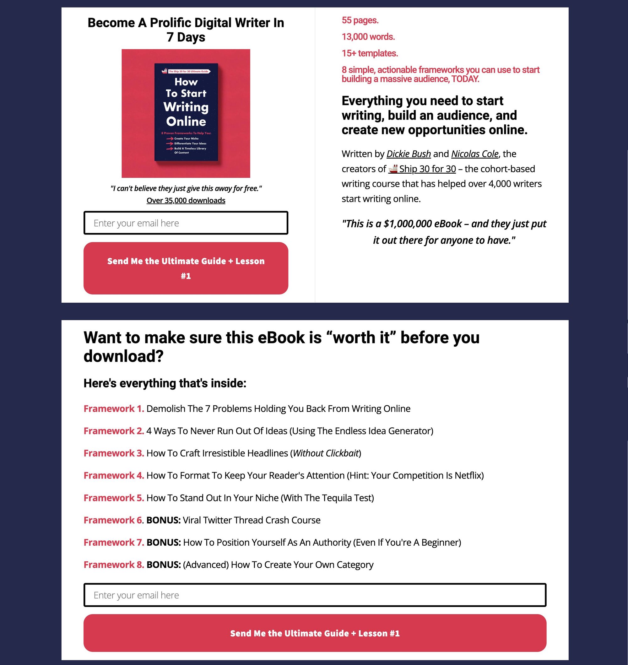
What’s interesting about this particular landing page is that it’s so minimalist. It has almost everything above the fold (the part you see before scrolling on a page): a header, benefits, and a call to action. Scrolling down gives you more features/benefits and another call to action.
Friction is kept to a minimum here: the page is short and to the point, and you only need to fill in your email address to get the course.
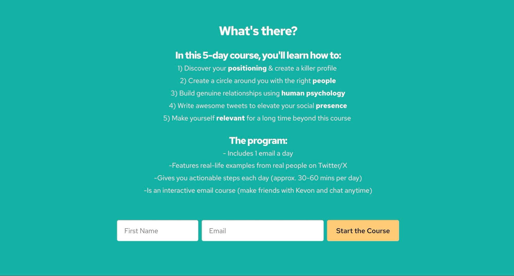
Making Twitter Friends
This 5-part course by Kevon Cheung teaches a few tactics to find your people on Twitter/X:
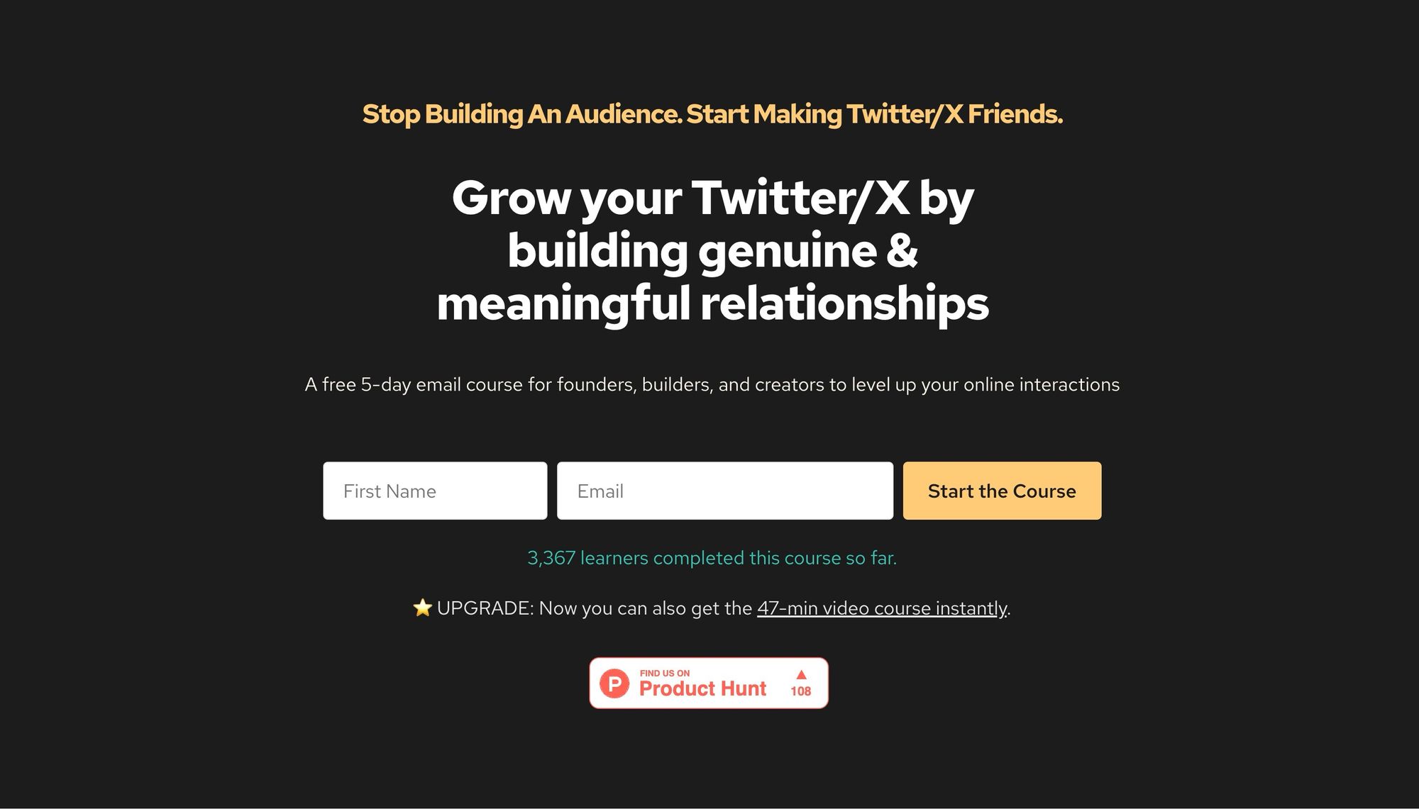
As you can see, the hero section contains a clear benefit and says who the course is for. It then immediately offers visitors to get the course. This page has more friction as it asks for a name and email, but it’s still easy enough. The hero section ends with some social proof (number of students and being featured on Product Hunt).
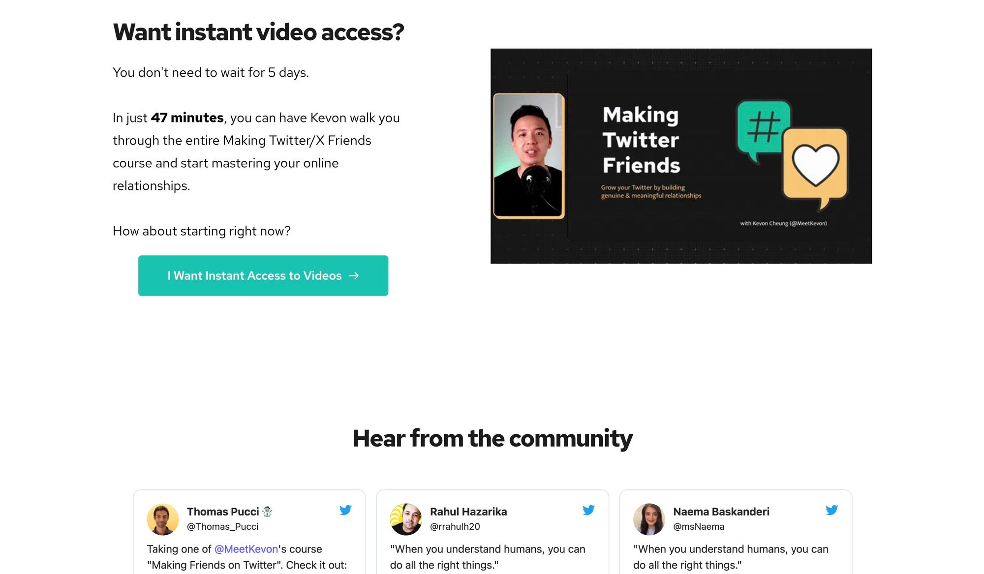
Below the fold, we see a secondary call to action by allowing people to buy the course as a video and get all the content immediately. This makes it, strictly speaking, not a squeeze page (after all, there are now three choices). But as the paid product is another version of the free course, I still see it as part of the single CTA.
In case the visitor still isn’t convinced, their eyes are pulled to the social proof and more benefits that stick out just from the bottom:
After more benefits and social proof, the visitor is again called to action when they see a summary of what they will get in exchange for their name and email. That seems like a steal at this point:
Double Your Freelancing
This landing page by Brennan Dunn is not a squeeze page as it has all of the traditional components that Julian recommends: a navbar, a hero section, social proof, features, calls to action, and a footer. But this homepage is still a great example of a landing page for email courses.
The star of the page is the hero section; it has an attention-grabbing headline, a clear benefit, social proof, and a call to action. You could create a page with just this header, and it would probably convert well:
This page is structured this way because it works. Brennan is the champion of personalized email sequences, so I recommend you sign up for his free email course. Pay close attention to how he uses surveys to send you only things that are relevant to you.
Your turn: What’s your favorite landing page?
If you’ve seen other great landing pages (whether for a product or an email course), please share them in the comments.
The more examples we see of effective landing pages, the more we can build our intuition for what works.
I hope to read from you!
—Ramses


